Google have said numerous times to keep your site structure simple (9) and not to stray too far from the norm. In the SaaS Industry we like to push the boundary and CEO’s and founders often have the most creative ways to engage with their users but in my experience its often tends to stray from the norm which can be an issue.
What might be simple to you might be incomprehensible to your customers, which brings me on to burger menus. Burger menus started out as an intuitive way of hiding secondary menus and over the last few years it has become the norm for mobile sites main nav, but are they the best choice of menu.
What Are Burger Menus & Where Did They Come From
Burger Menus have been around for years, the original creator Norm Cox (1) created the first burger menu in 1981. It was originally around 16 x 16 pixels and had to be easily transferable to different designs which had limited capability at rendering images. Just an interesting FYI, Norm also designed the famous document icon we still use today.
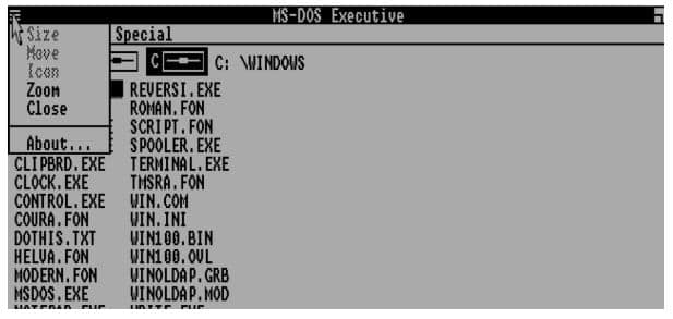
It took some time for the burger menu icon to catch on and in 1985 it was used as the file menu on Microsofts where you had some minor, secondary functions hidden such as zoom and close, etc
There is an actual Microsoft 1985 interface you can use here
https://www.pcjs.org/disks/pcx86/windows/1.01/cga/
The Hamburger menu died after this version for some time or at least we haven’t been able to find any trace of it. Later it reappeared in 2008 on Facebook’s mobile site as well as in 2009 when iOS used it for their mic recorder. (3)
This seemed to be the start of a trend setter for mobile devices to hide complicated menus that affected the user interface.
So What’s My Beef With A Burger Menu
I quite like the look and feel of a burger menu and they are very functional, but here is the issue. It’s not intuitive to use a burger menu for everyone and so your designer should be aware of that. Users find it very hard to find content hidden behind a burger menu, in fact they’re more likely to scroll the full length of the page before stopping to open a burger menu. It makes perfect sense, you aren’t putting the menu right in front of their faces so therefore they are less likely to click that content.
It’s a relatively easy theory to follow but we also have some proof that shows people struggle with burger menus thanks to Madejska, Annika Persson, Alexander who have done extensive research in the area.
Their paper “Menu anchor interactors in mobile website contexts: The perceived usability of menu navigation on three different types of websites” (4) shows how people interact with different menu designs and what results you can expect.
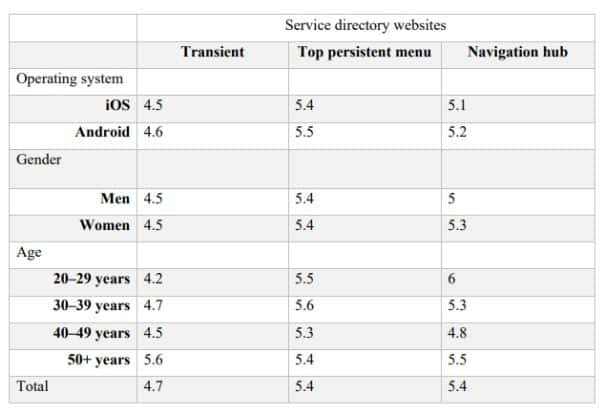
They created an experiment where they set tasks for 240 people with a variety of different ages and a 50/50 gender split. They tested the burger menu (transient menu anchor interactor), Top Menu (Top Persistent Menu Anchor Interactor) and a Navigational Hub Menu Anchor Interactor.
They did this across 3 different types of mock up sites they created in adobe UX. You can see the image below of these mock ups.
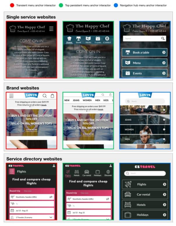
So what did they find
*Results are marked 1 – 7 with 7 being easy and 1 being difficult
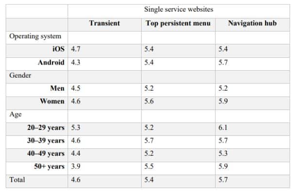
For the services websites here’s what they found, on Android a navigational hub is actually the easiest way to find your way around a site with the burger menu proving difficult for some. For a younger audience there is a little difference between the navigational hub and the burger menu but for people 50+ it looks like a big issue.
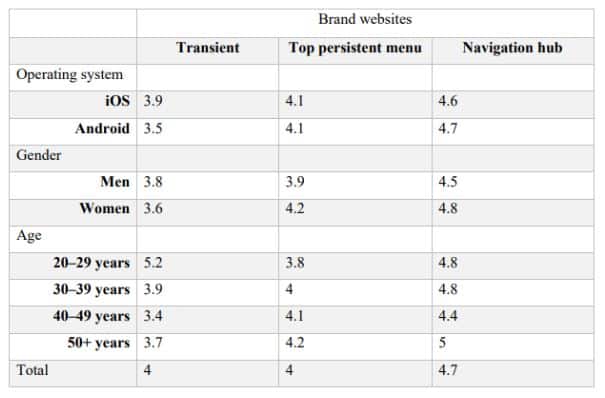
Likewise for the directory site and brand websites the results were much the same.
If you’d like to run similar experiements download out Google Analytics check list to get started on tracking your websites data
Should You Use A Burger Menu
It depends on what the menu is for and who your audience is. Here is an interesting fact, spotify got rid of their burger menu and saw 30% increase in navigational clicks (5). I 100% don’t think that a burger menu should be the default design. It needs to be thought out and your end user needs to be considered.
- Will they know what a burger menu is?
- Do we want the user to scroll down the page or click on a link?
- Do we need to physically write menu on it?
Burger Menus have become default and from a design perspective they aren’t always the best choice.
Burger Menu Alternatives
There are numerous alternatives you can use and it’s probably worth testing a number of them to determine what’s best for your users. You can easily test different version of your site using a tool like google optimizely to run your own experiement.
Burger Menus & SEO
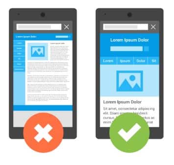
While google have never come out and physically said anything about burger menus they have said that tabbed content isn’t demoted for mobile first indexing (6)but it is worth noting when they released their webcentral blog post about the mobile friendly roll out they had an image of a mobile friendly site and the image did not have a burger menu but a Top Persistent Menu (7)
You should be prioritising your top pages to ensure users are finding them and it’s easy for google to access them.
In the end, SEO is about good user experience and delivering an experience. The BBC mentioned in an article that not having a burger menu but the words menu increased CTR by 20% from their burger menu.(8) “Switching the lines for the word “menu” makes 20% more people click, Foster found.”
You need to always be thinking of your users and not taking into account designs you like. You need to keep it simple for your users, do what they know works, don;t expect them to be able to follow your train of thought.
References
- https://www.evernote.com/shard/s207/client/snv?noteGuid=022f2237-4b4f-4096-87f2-053acd228c2d¬eKey=ede2672bc3f39a1b0232f84e01ca0a83&sn=https%3A%2F%2Fwww.evernote.com%2Fshard%2Fs207%2Fsh%2F022f2237-4b4f-4096-87f2-053acd228c2d%2Fede2672bc3f39a1b0232f84e01ca0a83&title=The%2Borigin%2Bof%2Bthe%2Bhamburger%2Bicon
- https://www.windowschimp.com/microsoft-first-used-the-controversial-hamburger-menu-in-1985/
- https://blog.placeit.net/history-of-the-hamburger-icon/
- http://www.diva-portal.org/smash/get/diva2:1330799/FULLTEXT01.pdf
- https://techcrunch.com/2016/05/03/spotify-ditches-the-controversial-hamburger-menu-in-ios-app-redesign/
- https://www.seroundtable.com/google-content-hidden-mobile-24111.html
- https://webmasters.googleblog.com/2015/04/rolling-out-mobile-friendly-update.html
- https://www.bbc.com/news/magazine-31602745
- https://blog.seoprofiler.com/googles-john-mueller-keep-it-simple-if-you-want-to-get-high-rankings/